
Blog

Why Warm Neutrals Are Replacing Cool Grays in Luxury Homes

Sarit Saruri
By Sarit Saruri Interior Conception Los Angeles Interior Design Studio
Why Warm Neutrals Are Replacing Cool Grays in Luxury Homes
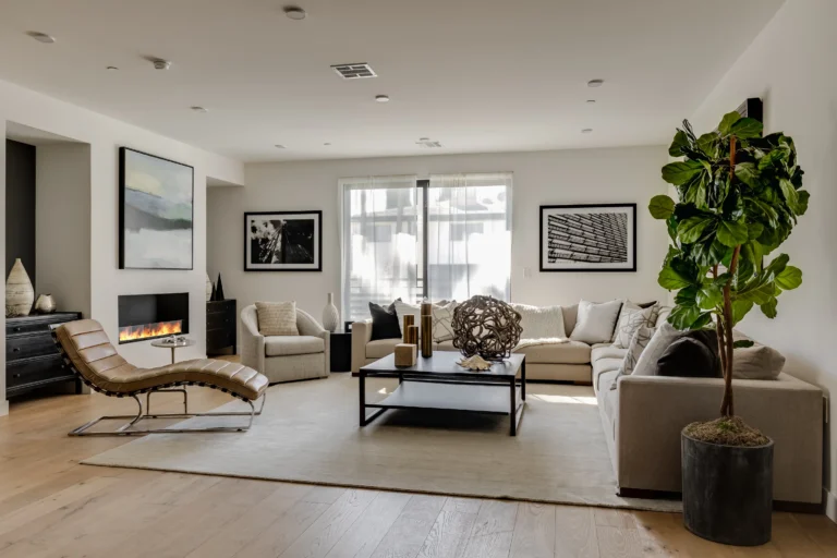
If you walk into most luxury homes designed in Los Angeles between 2010 and 2020, you will notice a common thread: cool gray walls, white Carrara marble, brushed nickel hardware, pale blue-gray upholstery. The palette was sophisticated, calm, and enormously popular. It was also, in retrospect, a little cold. The shift that has been underway for the past few years is not simply a trend change. It reflects a genuine recalibration in how high-end residential clients think about what home should feel like. Warm neutrals, the creams, taupes, ochres, sand tones, and natural wood colors that reference earth and stone rather than concrete and metal, produce rooms that are easier to spend time in, that feel more personal, and that photograph better in actual residential lighting.
01 What Warm Neutrals Actually Look Like

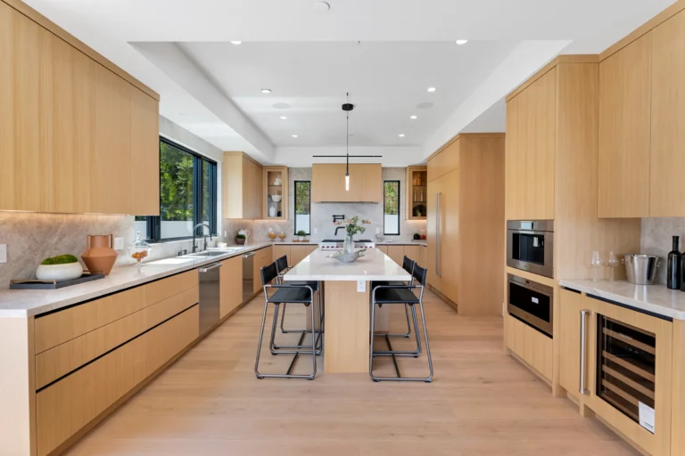
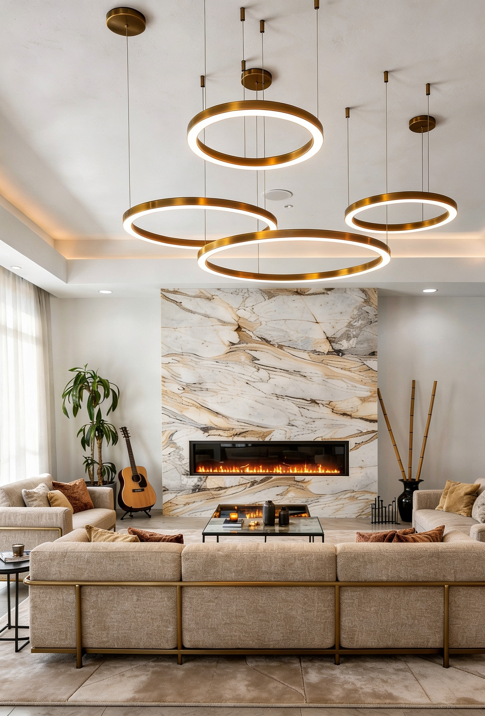
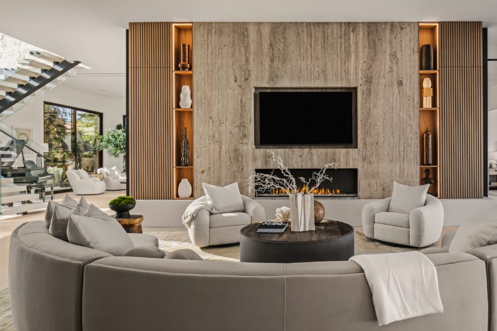
Warm neutral is not beige in the way the 1990s understood it. The current palette in high-end interior design is considerably more refined: plaster walls in raw umber or warm white rather than painted drywall; upholstery in textured linen, bouclé, or cashmere rather than smooth polyester blends; floors in wide-plank natural oak rather than engineered light gray; stone in travertine, cream marble, or honey quartzite rather than stark white. The warmth comes from the material itself more than from a color chip, which is why the rooms that execute this palette best are the ones where every surface has texture and genuine depth.
Luxury Modern Estate Encino Family Room Travertine Fireplace Wall Wood Slat

02 How to Transition an Existing Space

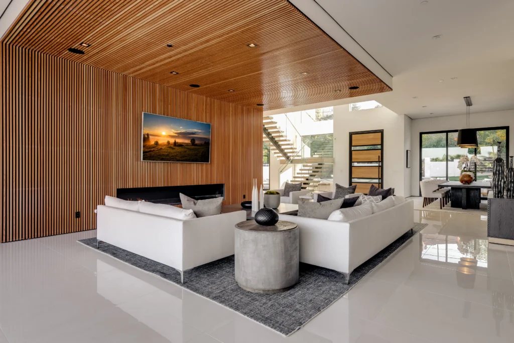
If you have a home designed in the cooler palette of the last decade and it no longer feels right, the most effective changes are not always the biggest. Replacing cool-toned upholstery with warmer fabrics, adding a large natural wool or hand-knotted rug in earthy tones, switching to warmer wood accents in coffee tables or side tables, and replacing cool white light bulbs with warmer ones (2700K rather than 3000K) can significantly change the feeling of a room without a renovation. For a more substantial refresh, changing a wall color from cool gray to a warm plaster tone, or replacing a cool-toned countertop in a luxury kitchen remodel with a natural stone that has more warmth, has an outsized effect on the overall palette of the home.
Tarzana Residence Living Room Wood Slat Feature Wall

03 Into 2027

The warm neutral shift is consolidating rather than peaking. For 2027, I expect the palette to expand toward deeper and more specific tones: terracotta, deep sand, ochre, and warm charcoal are all entering the conversation in high-end residential interior design in Los Angeles. The warmth stays. The restraint evolves into something with more confidence and more color depth.

Start a Conversation

We would love to hear about your project.

Contact Us
Continue Reading