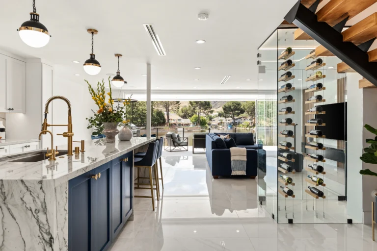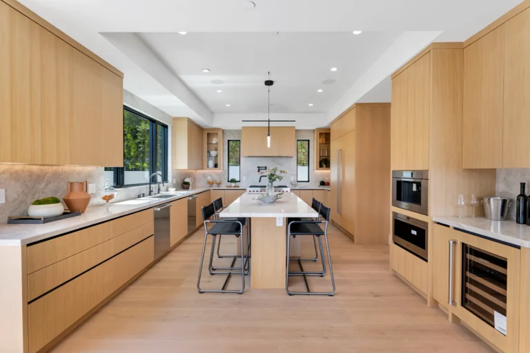

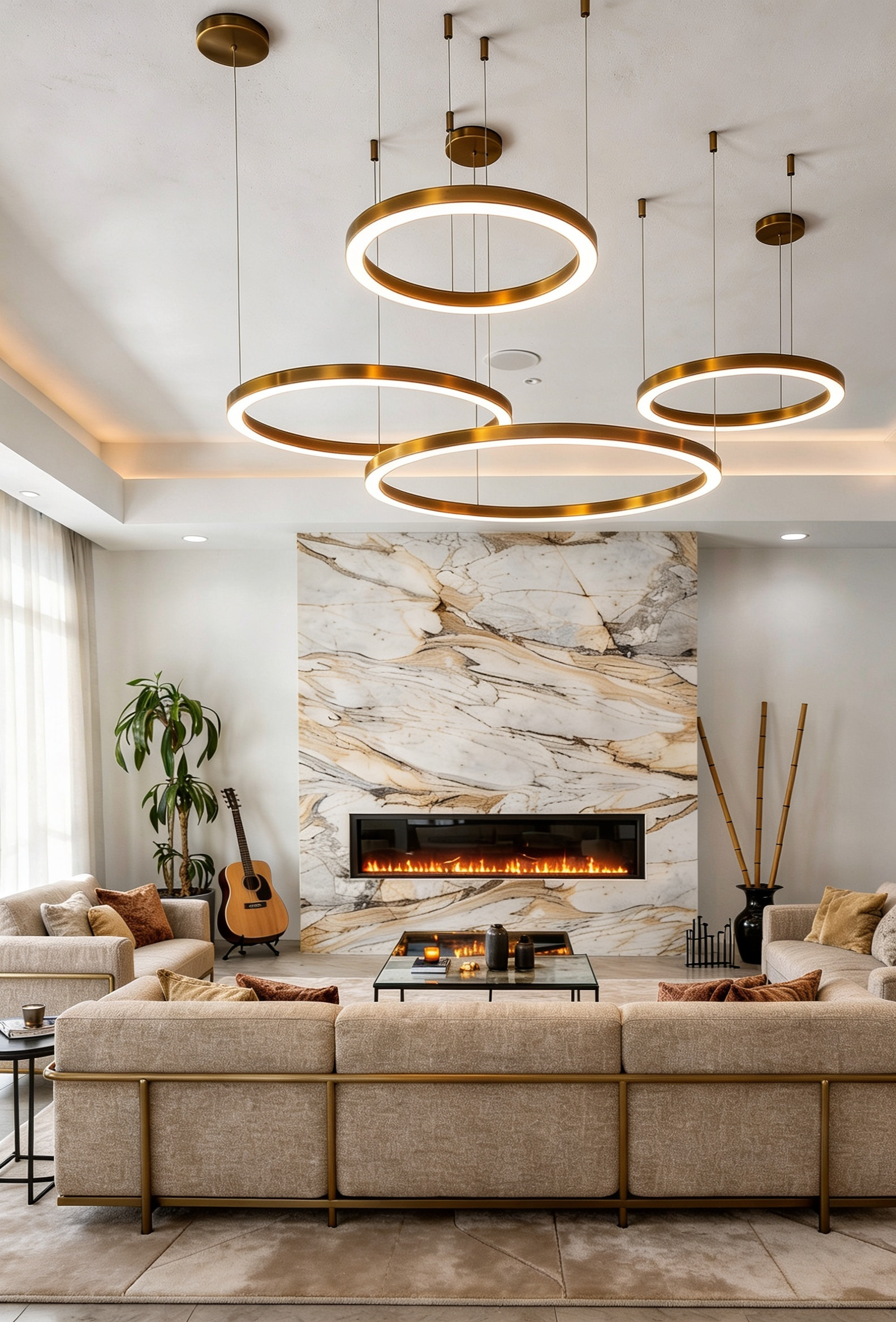
If you walk into most luxury homes designed in Los Angeles between 2010 and 2020, you will notice a common thread: cool gray walls, white Carrara marble, brushed nickel hardware, pale blue-gray upholstery. The palette was sophisticated, calm, and enormously popular. It was also, in retrospect, a little cold.
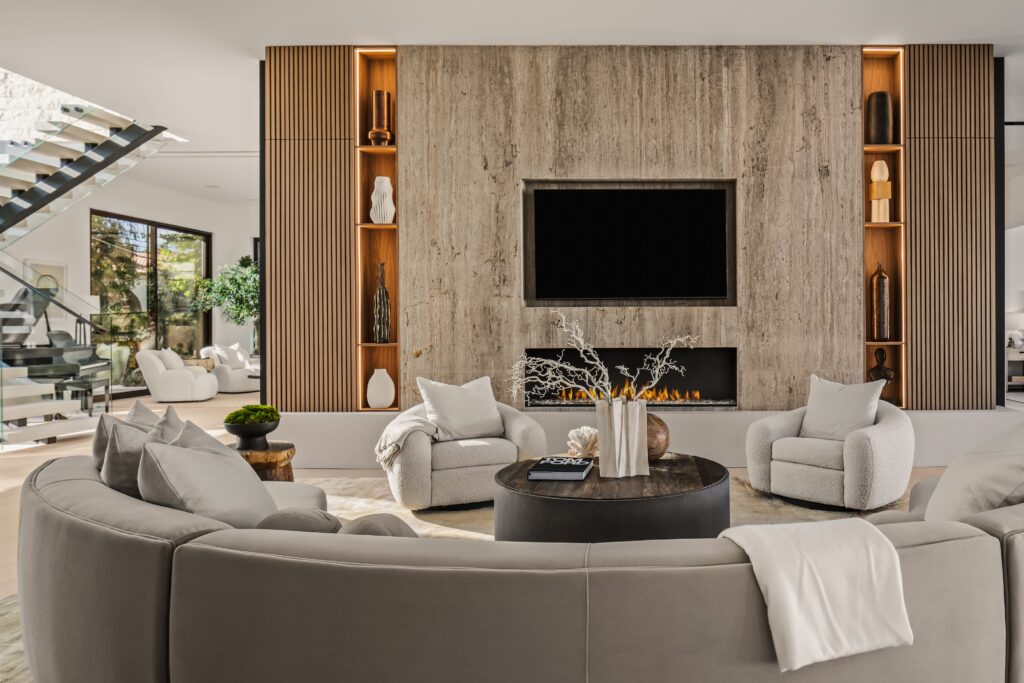
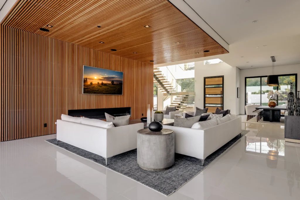
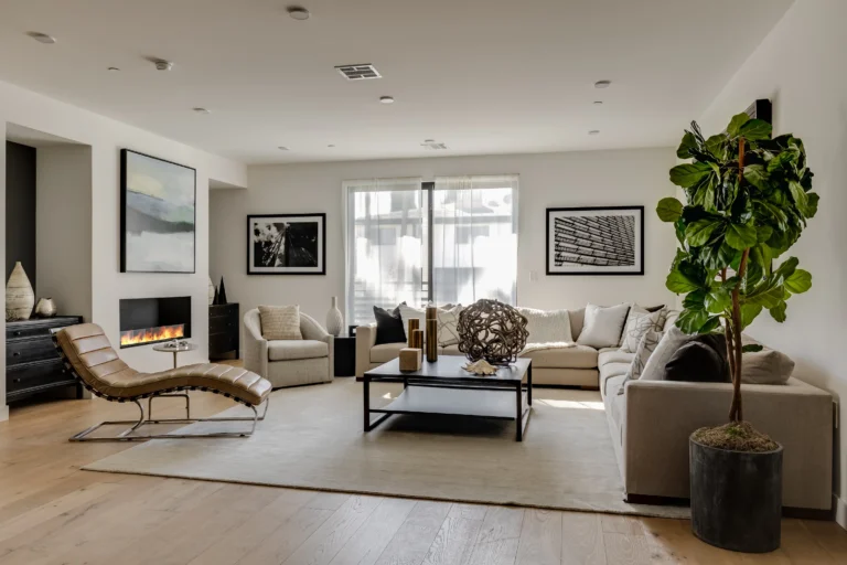
The shift that has been underway for the past few years is not simply a trend change. It reflects a genuine recalibration in how high-end residential clients think about what home should feel like. Warm neutrals, the creams, taupes, ochres, sand tones, and natural wood colors that reference earth and stone rather than concrete and metal, produce rooms that are easier to spend time in, that feel more personal, and that photograph better in actual residential lighting.
Article